The Form Designer creates a web form (ASPX and code-behind) that's based mainly on both ASP.NET Framework and WorkflowGen.My libraries.
This gives you the advantage of many possibilities for customizing and integrating the web form to your specific needs, especially in an advanced and integrated development environment such as Visual Studio.
A first version is created, which is done quickly and easily using the built-in form designer. The end-users will then test the first version as proof of concept.
Later, the process can be deployed for production if it meets the business's and end-users' expectations.
If there are custom or advanced functionalities required in a new version that aren't available in the built-in form designer, then the process can be migrated to the web form development.
In order to migrate a process with a built-in form to a process web form, follow these steps:
Create a new version of or duplicate the process.
Uncheck the Built-in form designer option in the New process information tab.
In Visual Studio, open the web form website with the folder path (\wfgen\wfapps\webforms[process name]\V[version number]) and start your development.
All connection strings in \wwwroot\wfgen\web.config are available for use in the Form Designer and Global Lists except for the master database connection string. While the application tries to verify that user-supplied SQL queries used in these contexts are secure and contain only SELECT statements, you should also make sure that exposed connection strings are secured at the database level. This means that if you don’t want a process manager or a Global List manager to be able to update or modify a certain database, the connection string should have read-only access to your database.
Keep in mind that process designers can also use any connection string that they have access to from the Form designer’s code-behind editor. If you want to restrict a Global List manager’s access to a connection string, while still allowing the process designer to use it, you should add the connection string to the web form application’s web.config (\wwwroot\wfgen\WfApps\WebForms\web.config).
Connection strings in web forms'web.config files are not exposed in the WorkflowGen UI, so for process designers to be able to use them, they must know the name of the connection string. This is also a convenient way to give different process managers access to specific connection strings.
You can choose to leave your web form folder ([process name]\V[version number]) as a sub-folder within the web forms web application (\wfgen\wfapps\webforms) or transform this folder into a web application in IIS.
The former case will make your web form dependent and uses the web form's web application resources (e.g. \bin, \App_Data, \App_Resource, \App_Themes, etc.) as it did prior to migration.
The latter case will make your web form as an independent web application. In this case, you'll need to copy the web form's \bin sub-folder to your web form’s folder and refresh the opened project in Visual Studio, if needed.
The built-in style templates (available in the Style drop-down menu) contain additional CSS that will automatically format and optimize a web form to display on smartphone and tablet devices, based on their screen resolution.
Custom styles can be created and deployed on the server using the following folder and file structure: \wfgen\App_Data\Templates\Forms[language][folder name]\css[style name].css
📌 Example
\wfgen\App_Data\Templates\Forms\En\MyCompany\css\MyStyle.css
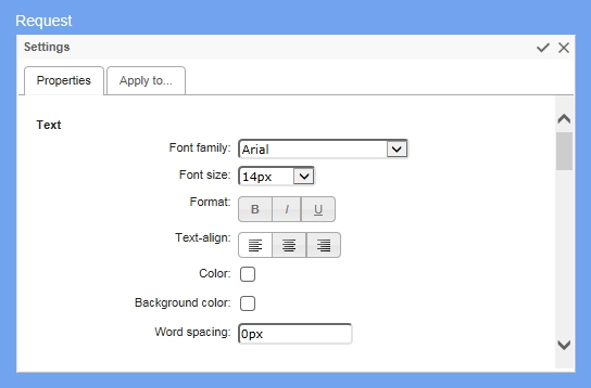
The Appearance Editor lets you customize the appearance of individual form items and provides further options. You can change the appearance of headers and footers, fields and their labels, radio buttons, checkboxes, the Submit button, and the optional Save-as-draft button. Click the Appearance tab to open the Appearance Editor.
You can use the Appearance Editor in Express or Advanced modes.
To use Express mode, hover over the item you want to customize and a toolbar will appear that lets you change the appearance of text and the size of the top margin. (If the item contains several fields, toolbars will appear in the corresponding positions.) You can also change the width of labels and fields.
Advanced mode provides extended customization options. To show the Advanced mode panel, hover over the item to display the Express mode toolbar, then click the pencil icon to the right.
Text lets you set the text appearance, alignment, and word spacing. Layout sets the width and padding of the item. Borders adds and customizes the appearance of borders. Field sets the top, left, and right margins of the field.
You can also add images to section headers and bodies:
The Image URL field contains the URL of the image to display.
Image repeat sets if and how the image will be repeated:
No repeat: the image will not be repeated
On the Apply to... tab, you can choose the items to which you want to apply the customized appearance settings using the checkboxes.
To apply your customized appearance and exit the Advanced mode menu, click the checkbox icon at the top right of the panel. To cancel changes and exit, click the x icon.
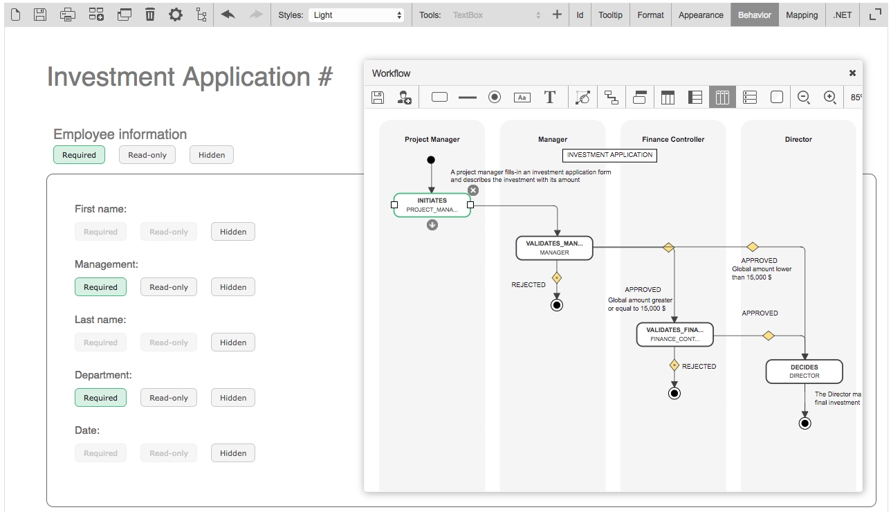
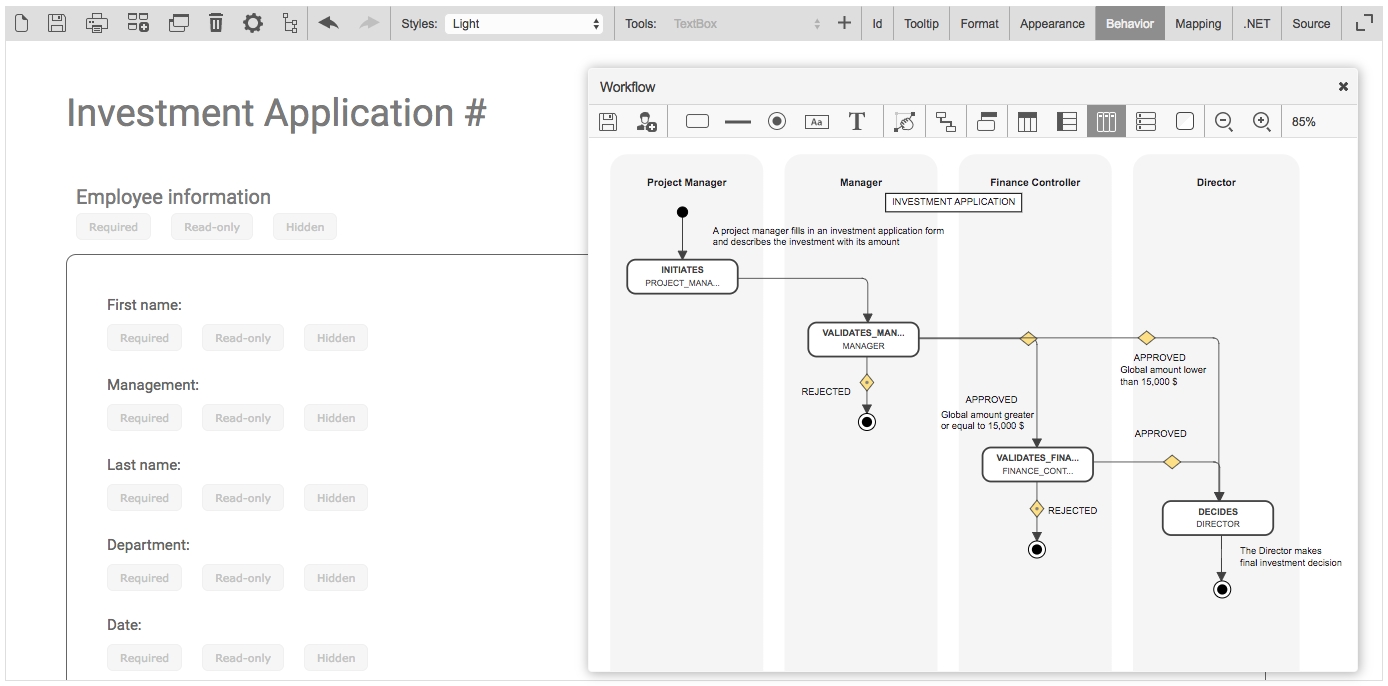
The Behavior section is used to visually define the behavior of form sections nd fields for each action of the workflow.
To activate the interactive workflow view and define the behavior of the form, click Behavior on the toolbar.
To define the behavior of sections and fields of the form at the action level, click the desired action in the interactive view of the workflow. Once the action is selected, the Required, Read-only, and Hidden settings are activated as clickable buttons for each section and the form field.
To activate the Required, Read-only, and Hidden settings of each section and form field, click the button related to the section or field for which you want to manage the behavior.
To define the behavior of the form for the other actions of the workflow, click another action via the interactive view and repeat the above operation according to the desired behavior.
* Not supported in field conditions.
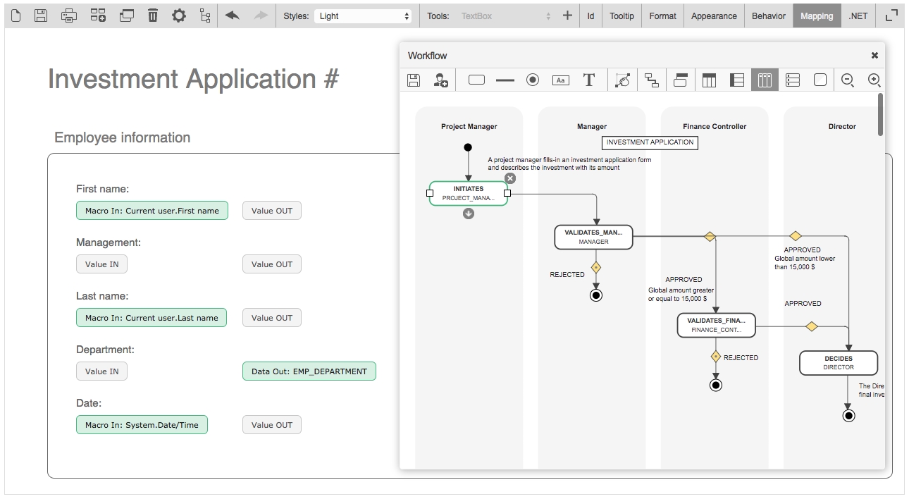
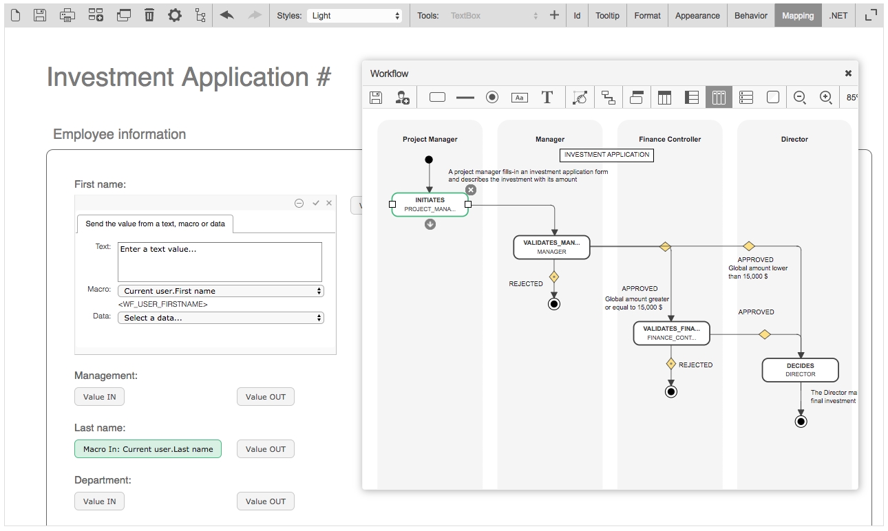
The Mapping screen enables you to visually define the default values (data in) and/or data to be stored by the workflow (data out) of the form fields for each action of the workflow.
To activate the interactive workflow view and manage the mapping of the form, click Mapping on the toolbar.
To set the default values of form fields at the action level, click the desired action in the interactive view of the workflow.
Once the action is selected, the Value IN and Value OUT buttons are activated in each form field.
A default value will automatically populate a field when displaying the form following the launch of an action. These default values can be of several types:
Manually-entered text
A macro selected from the list of available macros
Workflow data selected in the data list
To set the default value of a field at the action level, click the Value IN button to the right of the field concerned.
In the dialog box that appears, set the default value of the field by entering text in the Text section, by selecting a macro from the drop-down Macro list, or by selecting process data in the Data combo box. Click the check mark at the top right to save.
To set the default values of other form fields for each of the actions of the workflow, click another action via the interactive view and repeat the previous operation.
To set the form data to be stored for an action, click the desired action in the interactive view of the workflow.
Data stored by the workflow corresponds to the value of form fields that will be retrieved by the workflow as a result of an action, and that can be used for the following purposes:
As workflow conditions
In the assignment of an action, setting the time for action and content of notifications
Through the tracking features and/or statistics (reporting)
To send the value of a form field and therefore store it as process data, click Value OUT to the right of each field in question.
Fields whose values have been sent are automatically declared in the Data tab of the process definition and will be usable as workflow transitions, as tracking features and statistics (reporting), etc.
To define the data stored for each of the actions of the workflow, click another action via the interactive view and repeat the previous operation.
To enable the Quick approval feature on validation actions, click the Quick approval tab and check Enable Quick approval. Click Edit email approval keywords to specify email approval keywords (comma-separated) for the configured Quick approval parameters. Once enabled, you can also Enable Quick approval comments for comments actions.
To enable Quick approval by default, check Enable Quick approval by default on the Portal tab in the Configuration Panel.
Repeat x: the image will be repeated horizontally only
Repeat y: the image will be repeated vertically only
Image position "x" aligns the image to the left, horizontal center, or right.
Image position "y" aligns the image to the top, vertical center, or bottom.
✔️
✔️
CheckBoxList
❌
✔️
✔️
CheckBoxListVertical
❌
✔️
✔️
Currency
✔️
✔️
✔️
Date
✔️
✔️
✔️
DateTime
✔️
✔️
✔️
DropdownListBox
✔️
✔️
✔️
Gridview
✔️*
✔️
✔️
Gridview - Column
✔️*
❌
❌
Label
❌
❌
✔️
ListBox
✔️
✔️
✔️
Numeric
✔️
✔️
✔️
Password
✔️
✔️
✔️
RadioButton
❌
✔️
✔️
RadioButtonList
✔️
✔️
✔️
RadioButtonList Vertical
✔️
✔️
✔️
ReadOnlyCurrency
❌
❌
✔️
ReadOnlyDate
❌
❌
✔️
ReadOnlyDateTime
❌
❌
✔️
ReadOnlyNumeric
❌
❌
✔️
ReadOnlyText
❌
❌
✔️
TextArea
✔️
✔️
✔️
Text
✔️
✔️
✔️
They should not contain spaces
They should not begin with the letters XML in any case (e.g. xml or Xml)
Otherwise, the action parameter will be successfully saved, but a warning message will be displayed upon saving. For more information, see https://www.w3schools.com/xml/xml_elements.asp.
Sections
Required
Read-only
Hidden
All sections
✔️
✔️
✔️
Default – Fields
Required
Read-only
Hidden
File attachment (Standard .NET FileUpload control)
✔️
✔️
✔️
File attachment (WorkflowFileUpload control)
❌
✔️
✔️
CheckBox
❌
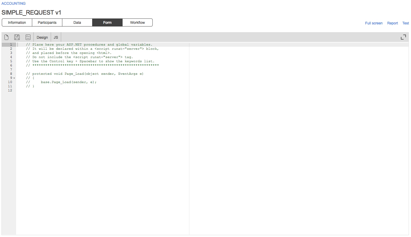
Click .NET in the toolbar to open the ASP.NET code editor, which can be used to define server-side procedures, events, and global variables to handle any specific custom tasks. This feature is mainly intended for ASP.NET server-side development.
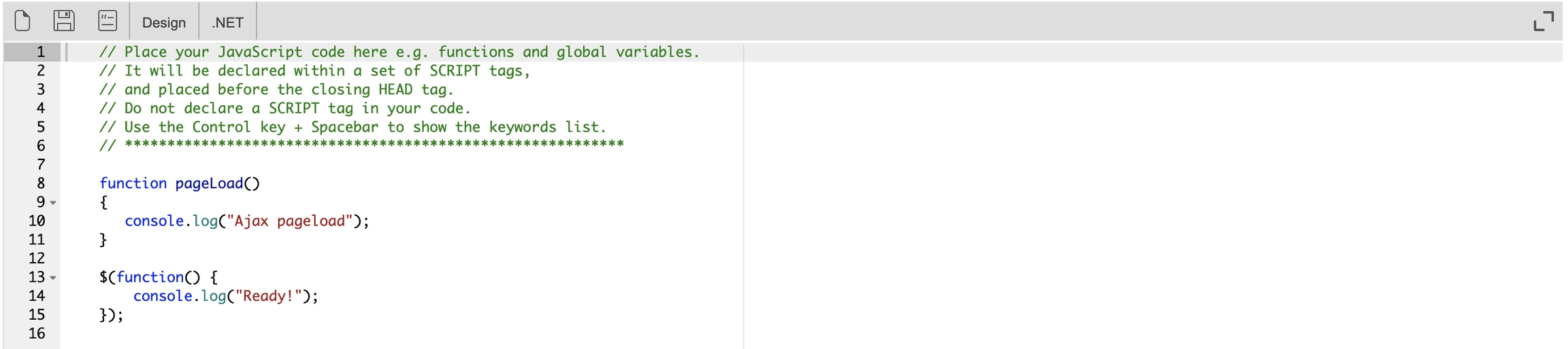
Click JS in the toolbar to open the JavaScript code editor, which can be used to define server-side procedures, events, and global variables to handle any specific custom tasks. This feature is mainly intended for JavaScript client-side development.
Check Enable server-side editing mode on the General tab in the Form configuration panel to activate this mode, which allows form designers to modify the content of the form's C# runat server tag (e.g. <script runat="server") and JavaScript script tag (e.g. <script jseditor="true">) directly in the generated default.aspx file on the server (usually located in the \wfapps\webforms[PROCESSNAME]\V[VERSION] folder) using Visual Studio Professional or Visual Studio Code.
You must save the form on the WorkflowGen Form screen every time you make changes to a script's code in the default.aspx file in order to keep the form's HTML script tags (FORM_HTML) up to date. This is mandatory before you can export the XPDL process definition for deployment on another server.
If you're using the Form Designer, you can enable AJAX mode by checking Enable AJAX mode on the General tab of the Form configuration panel.
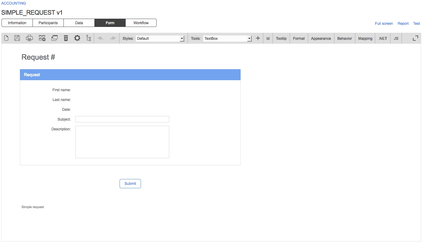
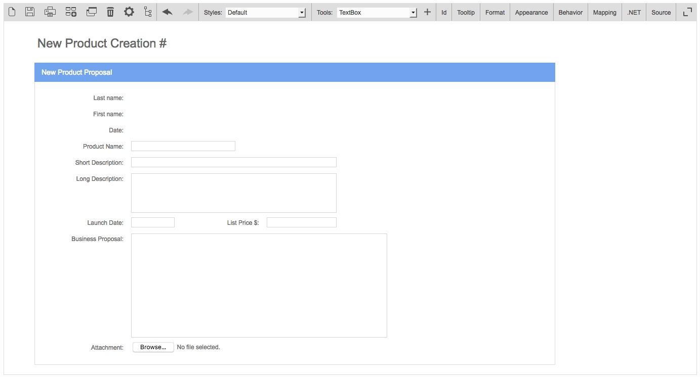
A form created with the built-in Form Designer has one header, one or several sections, one or several fields per section, a Submit button, an optional Save as a draft button, and one footer.
Saves the selected section or field as a custom tool
Duplicate a section or field
Makes a copy of the selected section or field and inserts it in the form. The duplicate section or field will appear below the selected section or field.
Delete a section or field
Deletes the selected section or field from the form
Form configuration
Opens the Form configuration window
Workflow view
Displays the interactive workflow view
Undo/redo
Undoes or redoes the most recent changes made to the form
Styles
Select a style
List of default and custom styles; select an item to change the style of the current form.
Tools
Select a tool
List of default and custom tools; select an item in order to add the tool to the form using the Insert button.
Insert the selected tool
Inserts the selected tool in the form
Id
Edit ID
Edit section and field identifiers
Tooltip
Edit tooltip
Edit section and field tooltips
Format
Edit format
Edit section and field format
Appearance
Edit appearance
Edit the appearance of headers, footers, labels, sections, and fields (see )
Behavior
Edit field and section behavior
Displays the interactive view of the workflow, activates the Required, Read-only, and Hidden clickable options for each form field, and sets the behavior of sections and form fields for each action (see )
Mapping
Edit field’s action data mapping
Displays the interactive view of the workflow, activates clickable options Retrieve the value and Send the value for each form field and defines the data input and output for each action (see )
.NET
ASP.NET
Switch to the ASP.NET code editor
JS
JavaScript
Switch to the JavaScript code editor
Switch to the Form Designer
JS
JavaScript
Switch to the JavaScript code editor
Switch to the Form Designer
.NET
ASP.NET
Switch to the ASP.NET code editor
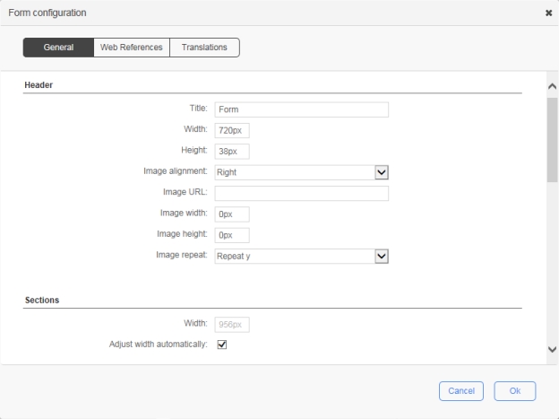
The width of the form header
Numeric value with or without the unit of measure (px, pt, in, cm, mm, pc, em, ex, %), e.g. 720px
Height
The height of the form header
Numeric value with or without the unit of measure (px, pt, in, cm, mm, pc, em, ex, %), e.g. 38px
Image alignment
The alignment for the header image:
Right: The image will be aligned to the right.
Left: The image will be aligned to the left.
None: No alignment.
Image URL
The URL of the image to be shown
Image width
The width of the image
Image height
The height of the image
Image repeat
Sets if and how the image will be repeated:
No-repeat: the image will not be repeated
Repeat: the image will be repeated both vertically and horizontally (this is the default setting)
Repeat x: the image will be repeated only horizontally
Sections
Width
The width for all sections
Numeric value with or without the unit of measure (px, pt, in, cm, mm, pc, em, ex, %), e.g. 720px
Adjust width automatically
Check to apply adjusted width to all sections
Labels
Alignment
The alignment for all field labels:
Right: the label will be aligned to the right of the field
Left: the label will be aligned to the left of the field
Top: the label will be aligned on top of the field
Width
The width for all field labels
Numeric value with or without the unit of measure (px, pt, in, cm, mm, pc, em, ex, %), e.g. 150px
Apply the width
Check to apply the width to all field labels
Buttons
Submit label
The label for the submit button
Save-as-draft label
The label for the save as draft button
Enable save-as-draft
Check to enable and display the save as draft button
Footer
Width
The width of the form footer
Numeric value with or without the unit of measure (px, pt, in, cm, mm, pc, em, ex, %), e.g. 720px
Height
The height of the form header
Numeric value with or without the unit of measure (px, pt, in, cm, mm, pc, em, ex, %), e.g. 22px
Image alignment
The alignment for the footer image:
Right: the image will be aligned to the right side
Left: the image will be aligned to the left side
None: no alignment
Image URL
The URL of the image to be shown
Image width
The width of the image
Image height
The height of the image
Image repeat
Sets if and how the image will be repeated:
No repeat: the image will not be repeated
Repeat: the image will be repeated both vertically and horizontally (this is the default setting)
Repeat-x: the image will be repeated only horizontally
Security
Enable XML Signature
Check to enable the use of XML signature in the form data
Digital signatures are used to certify that a document has not been modified by the system or by someone who gained unauthorized access to the system. The XML signature is a W3C standard that defines the syntax and processing rules for creating and representing digital signatures. This is a method of associating a key with referenced data to insure the integrity of this data.
Misc.
Display a confirmation message for quick deletion
Check to prompt a confirmation message prior to deletion
Icon
Name
Description
New form
Creates a new form or replaces the current form
Save the form
Saves the current form (you can also press Ctrl+S to save)
Print the form
Prints the current form
Icon
Name
Description
New
Clears the ASP.NET code
Save
Saves the ASP.NET code
Comment/Uncomment
Adds or removes // before the selected line(s)
Design
Icon
Name
Description
New
Clears the JavaScript code
Save
Saves the JavaScript code
Comment/Uncomment
Adds or removes // before the selected line(s)
Design
Name
Description
Web forms
Enable server-side editing mode
Enable AJAX mode
See AJAX mode
Header
Title
The title of the form
Name
Description
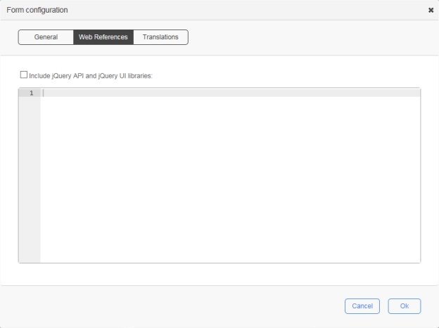
Include jQuery API and jQuery UI libraries
Check this option to include the jQuery and jQuery UI libraries in runtime mode (form execution); by default, these libraries are available in design mode
Available versions:
v1.7.2 & v1.8.20
v1.10.2 & v1.10.3
v3.5.1 & v1.12.1 (default)
Free text
Custom web references to be included in the HTML head that will be available in both design and run-time modes. Only <script>, <meta>, <link>, and <style> tags are supported. When you enter a tag, the free text editor automatically inserts its closing tag.
📌 Example:
<link rel="stylesheet" type="text/css" href="mystyle.css" />
<style type="text/css">
body {background-color:yellow}
p {color:blue}
</style>
<meta name="description" content="my content" />
<script type="text/javascript">
alert("Hello World!");
</script>
<script type="text/javascript" src="myscript.js">
</script>
To fold a code block, click the down arrow next to the line number, which will insert a double-arrow icon in place of the code. To unfold the code block, click the right arrow.
Press Ctrl+Spaceto display a drop-down menu that lists the available variables and keywords.
Name
Description
Select a language
The Form Designer allows you to translate form labels and error messages to the languages available in WorkflowGen. Select a language for translation from the languages available in the drop-down list.
✏️ Note: Generic language selections such as English, French, Spanish, etc., correspond to the version of the language that the administrator initially used to create a form. For example, if the administrator used English (United States) to create a form, then in this instance the selections English (United States) and English would be one and the same.
Free text
Write translated text that corresponds to the selected language. If a field is left empty, then the language will defer in the following order: Country-specific language > Generic language > Default language.
Save a section or field as tool
Form Designer
Form Designer
Width
protected void Page_Load(object sender, EventArgs e)
{
    base.Page_Load(sender, e);

    // Register the custom button to the script manager for postback management in AJAX mode
    if (ScriptManager.GetCurrent(this) != null) {
        ScriptManager.GetCurrent(this).RegisterPostBackControl(ACTION1_BUTTON1);
    }
}
Repeat y: the image will be repeated only vertically
Repeat-y: the image will be repeated only vertically

The header contains a title, a label, and an optional image.
The title can be used to display the process name. Its text can be edited directly in the form.
The label is used to display the current request number. Its default identifier is CURRENT_REQUEST and can be referenced in an action parameter to receive the Request.Id macro.
The image is used to display a logo. It can be resized or realigned.
A fixed width and height can be set for the header in the form configuration window.
The section has a title to display the section name. Its text can be edited directly on the form.
It can have one or several fields.
Each section must have a unique identifier.
Sections can only be aligned vertically and reordered using the mouse drag-and-drop action.
See for the different types of default section.
The field has a label and an input control.
The label is used to display the name of the field. Its text can be edited directly on the form. It can be resized and realigned.
A fixed width can be set for all labels (General / Labels).
The input control is where a value is captured in the form. It can be resized and realigned.
See for the different types of default field.
The Submit and Save as draft buttons can be renamed in the form configuration window (General / Buttons) or in the Appearance Editor (see ).
The Save as draft button can be enabled or disabled as well.
Their identifiers are submitButton and saveAsDraftButton
The footer contains a title and an optional image.
The title can be used to display a note. Its text can be edited directly on the form.
The image is used to display a logo. It can be resized or realigned in the form configuration window (General / Footer) or in the Appearance Editor (see ).
Default and custom tools are available in the Tools drop-down list.
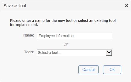
This feature allows a form designer to save an existing section or field in the current form as a custom tool template in order to be reused in other forms. First, select a section or field then click the Save a section or field as tool icon on the toolbar (see ).
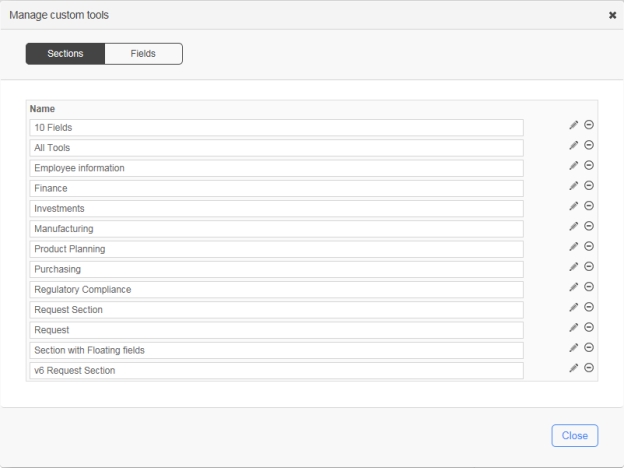
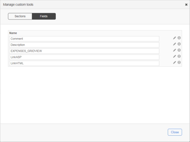
To open this window, click the Tools drop-down menu and select Manage custom tools, which allows you to delete custom tools.
These settings apply to Currency, Date, DateTime, Numeric, Password, and TextArea fields.
These settings (except Items) apply to Label, ReadOnlyCurrency, ReadOnlyDate, ReadOnlyDateTime, ReadOnlyNumeric, and ReadOnlyText fields as well.
The Form Designer supports a custom field tool that is an ASP.NET user control. You can create this tool and manually deploy it on the server. It must have the following elements, folder and file structures:
User control field template:
\wfgen\App_Data\Templates\Forms\[language]\[folder name]\fields\[user control name].txt
User control sources:
ASCX: \wfgen\WfApps\WebForms\[user control name].ascx
Code-behind: \wfgen\WfApps\WebForms\[user control name].ascx.cs
When you enter a tag, the user control field automatically inserts its closing tag. To collapse a code block, click the down arrow next to the line number, which will insert a double-arrow icon in place of the code. To expand the code block, click the right arrow. Press Ctrl+Space to show a drop-down menu that displays the available variables and keywords.
The user control field supports the Custom attributes settings (see ).
The ID menu in the toolbar will activate the field’s identifier edit mode. You can change the identifier of the header label, sections and fields. Identifiers are normally used to identify a form element such as a section or a field in WorkflowGen’s action parameters (e.g. FORM_FIELDS_REQUIRED) or in the form’s ASP.NET code-behind.
Each identifier must be unique.
It must start with a letter.
It can only contain alphanumeric and underscore characters.
It is case sensitive.
The Tooltip menu in the toolbar will activate the field’s tooltip edit mode. You can change the tooltip for the form fields only. Tooltips are normally used to display more information about the field when the user moves the mouse pointer over it.
The Format menu in the toolbar will activate the field’s format edit mode. You can change the format of TextBox, Currency, Date, DateTime, Numeric, Label, ReadOnlyCurrency, ReadOnlyDate, ReadOnlyDateTime, ReadOnlyNumeric and ReadOnlyText fields. Formats are normally used to specify the way to capture and display a specific type of value based on the user’s language and culture.
When inserting a section tool into the form, the new section will be placed in the last position.
Section width will be resized automatically based on the widest field in the form whenever there is a field width change.
A fixed width can be set for all sections.
The section’s settings can be edited by clicking the pencil icon on the right side of the section name.
Each field must have a unique identifier.
Fields within the same section are prefixed with the section’s identifier following an underscore character.
Fields within a section can be reordered vertically using the mouse drag-and-drop action.
A field can be moved from one section to another section using the mouse drag-and-drop action.
When inserting a field tool into the form, the new field will be placed in the last position of the selected section or the first section if no section is selected.
By default, fields are aligned vertically on the same column.
Two fields can be aligned horizontally on the same row using the Remove line break button (left arrow) on the right side of the first field.
Two fields can be aligned vertically on the same column using the Line break button (right arrow) on the right side of the first field.
The field’s settings can be edited edited by clicking the pencil icon on the right side of the field.
The header title label
The header image
The footer title label
The footer image
A section that has no fields
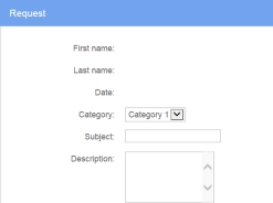
Request
A section that contains first name, last name, and date fields in read-only, plus a category drop-down list, subject textbox, and description multiline textbox
Standard
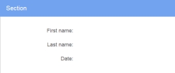
A section that contains first name, last name, and date fields in read-only
Default fields
Attachment
Attach one file
CheckBox
Single checkbox
CheckBoxList
Multiple checkboxes in horizontal alignment
CheckBoxListVertical
Multiple checkboxes in vertical alignment
Currency
Input for currency value
Date
Input for date value
DateTime
Input for date time value
DropDownListBox
List of items for a single choice selection
GridView
Dynamic table of multiple input fields; each column represents a field and each row represents a record
Label
Text displayed in read-only
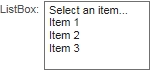
ListBox
List of items for a multiple choice selection
Numeric
Input for numeric value
Password
Input for password value (the entered text will be masked)
RadioButton
Single radio button
RadioButtonList
Multiple radio buttons in horizontal alignment
RadioButtonListVertical
Multiple radio buttons in vertical alignment
ReadOnlyCurrency
Read-only currency value
ReadOnlyDate
Read-only date value
ReadOnlyDateTime
Read-only date time value
ReadOnlyNumeric
Read-only numeric value
ReadOnlyText
Read-only text value
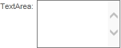
TextArea
Multiline textbox
TextBox
Single line textbox
Delete the current custom field tool
The section fields are required based on a custom condition. If the condition is empty then it will be true. The custom condition must be server-side C# syntax code.
📌 Example: MyTextBox.Text == "Hello World"
Read-only
Sets the section’s fields to read-only
Condition
The section fields are read-only based on a custom condition. If the condition is empty then it will be true. The custom condition must be server-side C# syntax code.
📌 Example: MyTextBox.Text == "Hello World"
Hidden
Sets the section fields to be hidden
Condition
The section fields are hidden based on a custom condition. If the condition is empty then it will be true. The custom condition must be server-side C# syntax code.
📌 Example: MyTextBox.Text == "Hello World"
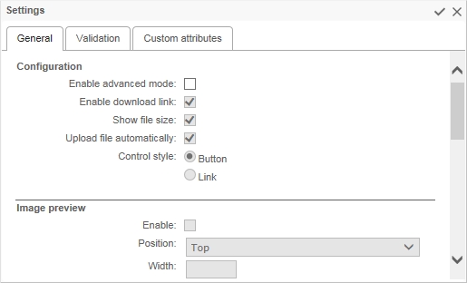
Displays the size of the uploaded file beside the download link
Upload file automatically
Automatically uploads the file, otherwise an upload button will be displayed
Control style
Display the Modify and Delete controls as links or buttons
Image/PDF preview
Display an image or PDF preview (thumbnail)
Position
Display the image preview above (Top) or below (Bottom) the attachment filename and controls
Width / Height
Sets the width and/or height of the image preview in pixels
⚠️ Important: You should only set one of these values in order to preserve the aspect ratio of the original image as displayed in the preview; otherwise, the image will appear distorted.
Storage in form archive
Web address (URL): Stores the image in the form folder
Embedded image: Embeds the image in the form archive HTML
File size limit (kB)
Defines the maximum size of the uploaded file in kilobytes
Size restriction error message
Write error that will appear if file exceeds the file size limit
Allowed extensions
Restricts the allowed file types by extension, separated by commas (e.g. txt,doc,html,xml,png)
Forbidden extensions
List of file extensions not allowed for links
Extension restriction error message
Write error message that will be displayed when file extension error occurs
Empty file error message
Write error message that will display when there is no file to link to
Add button label
Display text for the add button
Update button label
Display text for update button
Delete button label
Display text for delete button
Overwrite button label
Allows you to choose a new file
Cancel button label
Allows you to cancel request for a new file
Display mode
Sets the default display mode:
Display: the field is read-only
Edit: the field can be edited
Download link
Check to display a link to download the uploaded file
Validation
Behavior
✏️ Note: To simplify the capture of a condition, the form fields and operators are listed in the Select a field... and Select an operator... drop-down menus. You can also press Ctrl+Spaceto display a drop-down menu that lists the available variables and keywords.
Required
Sets the field to be required
Condition
The field is required based on a custom condition. If the condition is empty then it will be true. The custom condition must be server-side C# syntax code. To help with the capture of the condition, the list of form fields and a list of operators are displayed.
📌 Example: MyTextBox.Text == "Hello World"
Read-only
Sets the field to be read-only
Condition
The field is read-only based on a custom condition. If the condition is empty then it will be true. The custom condition must be server-side C# syntax code. To help with the capture of the condition, the list of form fields and a list of operators are displayed.
📌 Example: MyTextBox.Text == "Hello World"
Hidden
Sets the field to be hidden
Condition
The field is hidden based on a custom condition. If the condition is empty then it will be true. The custom condition must be server-side C# syntax code. To help with the capture of the condition, the list of form fields and a list of operators are displayed.
📌 Example: MyTextBox.Text == "Hello World"
Custom attributes
Name
Any name that is not in the list of standard reserved attribute names (id, name, class, style, title, multiple, type, value, checked, runat)
Additional reserved attribute names specific to File attachment / General:
Value
Any value
Add a new attribute
Remove the current attribute
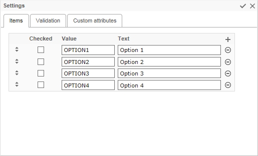
Value of the checkbox/radio button
Text
Display text of the checkbox/radio button
Add a new checkbox/radio button
Delete the current checkbox/radio button
Validation
Behavior
✏️ Note: To simplify the capture of a condition, the form fields and operators are listed in the Select a field… and Select an operator... drop-down menus. You can also press Ctrl+Spaceto display a drop-down menu that lists the available variables and keywords.
Required
Sets the field to be required
Condition
The field is required based on a custom condition. If the condition is empty then it will be true. The custom condition must be server-side C# syntax code.
📌 Example: MyTextBox.Text == "Hello World"
✏️ Note: The checkbox fields (list or single) and single radio button are not supported by this behavior.
Read-only
Sets the field to be read-only
Condition
The field is required based on a custom condition. If the condition is empty then it will be true. The custom condition must be server-side C# syntax code.
📌 Example: MyTextBox.Text == "Hello World"
Hidden
Sets the field to be hidden
Condition
The field is required based on a custom condition. If the condition is empty then it will be true. The custom condition must be server-side C# syntax code.
📌 Example: MyTextBox.Text == "Hello World"
Custom attributes
aslist
This property allows a radio button and checkbox field with one item to be converted as a list control (RadioButtonList / CheckBoxList) instead of a RadioButton / CheckBox control in the web form. Accepted Boolean values: true or false
Sets the field to be required
Condition
The field is required based on a custom condition. If the condition is empty then it will be true. The custom condition must be server-side C# syntax code.
📌 Example: MyTextBox.Text == "Hello World"
Read-only
Sets the field to be read-only
Condition
The field is read-only based on a custom condition. If the condition is empty then it will be true. The custom condition must be server-side C# syntax code.
📌 Example: TextBox.Text == "Hello World"
Hidden
Sets the field to be hidden
Condition
The field is hidden based on a custom condition. If the condition is empty then it will be true. The custom condition must be server-side C# syntax code.
📌 Example: MyTextBox.Text == "Hello World"
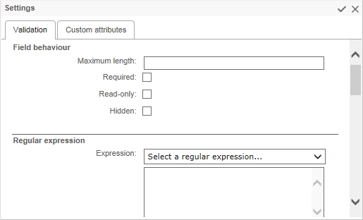
Regular expression
Expression
A regular expression to determine validity.
📌 Example: email address: \b[A-Za-z0-9._%+-]+@[A-Za-z0-9.-]+\.[A-Za-z]{2,4}\b
A regular expression can be entered freely into the designated area. It is also possible to use regular expressions in the Select a regular expression list.
Error message
Message to display when the validated field is invalid
Range
Minimum value
Minimum value for the field being validated
Maximum value
Maximum value for the field being validated
Error message
Message to display when the validated field is invalid
Custom
OnServerValidate
Server-side C# syntax validation code; must return a Boolean value (true or false)
Validate empty text
Whether the validator validates the control when the text of the control is empty
Error message
Message to display when the validated field is invalid
Compare
Value to compare
Value to compare against
Control to compare
Select another field in the current form to compare against
Operator
Comparison operation to apply to values:
Equal (=)
Greater than (>)
Greater than or equal to (>=
Error message
Message to display when the validated field is invalid
Custom attributes
timezoneconversion
Applicable to Date and DateTime textbox fields only
This property allows the disabling of the default user time zone conversion behavior when the form field is in the Date or DateTime format.
This option is useful if you want to capture and maintain a consistent date-only value in the form field and process data without applying the time zone conversion that sometimes changes the date value depending on the original and current user time zones.
Accepted Boolean values: true or false
Additional reserved attribute names specific to validation
maxlength, requiredcondition, readonlycondition, hiddencondition, validationexpression, regularexpressionerrormessage, minimumvalue, maximumvalue, rangeerrormessage, onservervalidate, validateemptytext, customerrormessage, valuetocompare
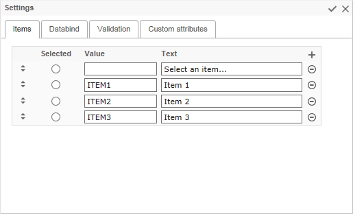
Value of the item
Text
Displays text of the item
Add a new item
Delete the current item
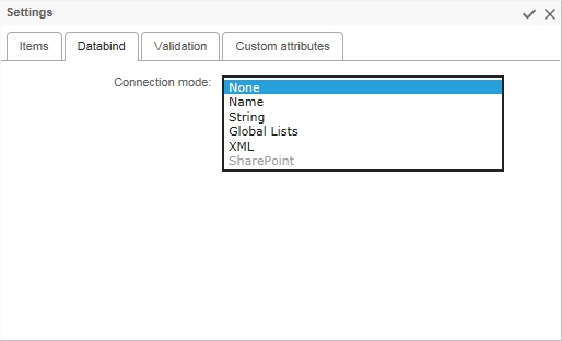
Databind
Connection mode
Select the type of connection for data binding:
Name
String
Global lists
Connection by name
Connection name
List of connection names defined in the WorkflowGen web configuration file (<connectionStrings>)
✏️ Note: It is strongly recommended to use a connection name rather than a connection string to simplify multi-environment management. Connection names are centrally managed in the WorkflowGen web.config file.
Select command
SQL select query
📌 Examples: select column_id, column_text from table_name;
Data value field
The data field that provides the item value
📌 Example: column_id
Data text field
The data field that provides the item text
📌 Example: column_text
Append data bound items
Check to append the data bound items to the list. Otherwise, the data bound items will replace all the existing items in the list.
Parameters
Name
Specifies the parameter name if the Select command uses a filter with a dynamic value from a parameter in the select query.
📌 Example: Name=PARAM; Select command=select column_id, column_text from table_name where column_id > @PARAM
Data type
Specifies the data type of the parameter: Boolean, Byte, Char, DateTime, DBNull, Decimal, Double, Empty, Int16, Int32, Int64, Object, SByte,
Filter by field
Specifies another field in the current form where the dynamic value will be retrieved
Default filter value
Specifies the default value if the parameter field has an empty value or no value
If the value is empty
Select from one of the following:
Do nothing
Remove all items
Filter on empty value
Connection by string
Connection String
Specifies the connection string
📌 Example: Data Source=sqlserver_name;Initial Catalog=wfgen;User ID=wfgen_user;Password=abc123!;
Provider name
List of provider names defined in the WorkflowGen web configuration file (AdministrationFormDataProviderName). It also supports custom defined third-party .NET data providers.
System.Data.SqlClient (.NET FWK Data Provider for SQL Server)
System.Data.OleDb (.NET FWK Data Provider for OLE DB)
System.Data.Odbc (.NET FWK Data Provider for ODBC)
Select command, Data value field, Data text field, Append data bound items, Parameters (Name, Field, Default value and Data type)
Same as Connection by name
Connection by global lists
List name
Specifies the list name
Data value column
Select the column used for item’s value
Data text column
Select the column used for item’s label
Sort column
Select the column used to sort the list
Append data bound items
Check to append the data bound items to the list. Otherwise, the data bound items will replace all the existing items in the list.
Filter
Column
Specifies the column name used to filter data
Comparison operator
Equal (=)
Not equal (<>)
Greater than (>)
Filter by field
Select the form field that contains the filter’s value
Default filter value
The default value if the field is empty
If the value is empty
Set the behavior of the filter if the value is empty
Connection by XML
URL
Specifies the file name of an XML file for data binding
📌 Examples:
c:\myfile.xml
http://server_name/myfile.xml
XPath
Specifies an XPath expression to be applied to the XML data contained by the XML file, e.g. rss/channel/item
XSL transform file
Specifies the file name of an Extensible Stylesheet Language (XSL) file (.xsl) that defines an XSLT transformation to be performed on the XML file
📌 Example: c:\myfile.xsl
Data value field, Data text field, Append data bound items
Same as Connection by Name
Connection by SharePoint 2007 and 2010
✏️ Note: The settings in the config file have to be set to detect SharePoint for this option to be active.
URL
URL of the SharePoint list
📌 Example: http://www.mysitesps.com/mylists
Name of the list
Name of the SharePoint list
📌 Example: Country
Data field value
Name of the column containing the value of the item
📌 Example: Id_Country
Data text field
Name of the column containing the text of the item
📌 Example: Description
Validation
Behavior
✏️ Note: To simplify the capture of a condition, the form fields and operators are listed in the Select a field… and Select an operator… drop-down menus. You can also press Ctrl+Spaceto display a drop-down menu that lists the available variables and keywords.
Maximum length
The maximum number of characters that can be entered
✏️ Note: Not available for TextArea fields.
Required
Sets the field to be required
Condition
The field is required based on a custom condition. If the condition is empty then it will be true. The custom condition must be server-side C# syntax code.
📌 Example: MyTextBox.Text == "Hello World"
Read-only
Sets the field to be read-only
Condition
The field is read-only based on a custom condition. If the condition is empty then it will be true. The custom condition must be server-side C# syntax code.
📌 Example: MyTextBox.Text == "Hello World"
Hidden
Sets the field to be hidden
Condition
The field is hidden based on a custom condition. If the condition is empty then it will be true. The custom condition must be server-side C# syntax code.
📌 Example: MyTextBox.Text == "Hello World"
Custom attributes
timezoneconversion
Applicable to Date and DateTime Label fields only
This property allows for the disabling of the the default user time zone conversion behavior when the form field is in Date or DateTime format.
This option is useful if you want to capture and maintain a consistent date-only value in the form field and process data without applying the time zone conversion that sometimes changes the date value depending on the original and current user time zones.
Accepted Boolean value: true or false
Additional reserved attribute names specific to Databind
connectionname, connectionstring, providername, xmldatasource, xpath, transformfile, selectcommand, parametername, parametercontrolid, parameterdefaultvalue, parametertype, datavaluefield, datatextfield
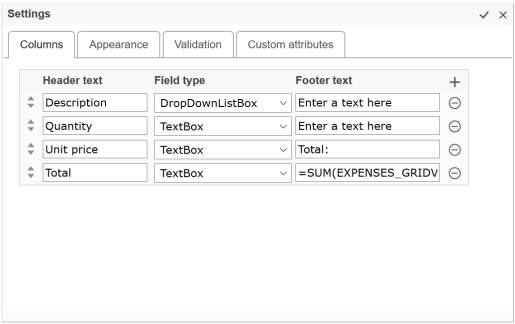
List of field types supported in the GridView:
DropDownListBox
ListBox
Label
Footer text
Display text of the column’s footer
The column’s footer text can be plain text or an expression used to filter rows, calculate the values in a column, or create an aggregate column (e.g. to calculate a summary from all the row values of the same column: =SUM). For more information, refer to DataColumn.Expression at .
Add a new column
Delete the current column
Appearance
Edit button label
Display text for the edit button
Delete button label
Display text for the delete button
Update button label
Display text for the update button
Cancel button label
Display text for the cancel button
Show edit button
Check to display edit button
Show delete button
Check to display delete button
Show header
Check to display the header
Show footer
Check to display the footer
Validation
Behavior
✏️ Note: To simplify the capture of a condition, the form fields and operators are listed in the Select a field... and Select an operator... drop-down menus. You can also press Ctrl+Spaceto display a drop-down menu that lists the available variables and keywords.
Required
Sets the field to be required
Condition
The field is required based on a custom condition. If the condition is empty then it will be true. The custom condition must be server-side C# syntax code.
📌 Example: MyTextBox.Text == "Hello World"
Read-only
Sets the field to be read-only
Condition
The field is read-only based on a custom condition. If the condition is empty then it will be true. The custom condition must be server-side C# syntax code.
📌 Example: MyTextBox.Text == "Hello World"
Hidden
Sets the field to be hidden
Condition
The field is hidden based on a custom condition. If the condition is empty then it will be true. The custom condition must be server-side C# syntax code.
📌 Example: MyTextBox.Text == "Hello World"
Additional reserved attribute names specific to GridView / Appearance
edittext, deletetext, updatetext, showheader, showfooter
Each field within a section will be automatically prefixed with the section’s identifier following an underscore character (e.g. section id=ACTION1; field id=ACTION1_MYFIELD1)
Each field within a GridView field will be automatically prefixed with the GridView’s identifier following the underscore character (e.g. gridview id=ACTION1_MYGRIDVIEW1; field id=ACTION1_MYGRIDVIEW1_TITLE1).
If the field is moved from one section to another section, then the field’s identifier will be automatically prefixed with the new section’s identifier.
If the section’s identifier is changed then all the fields within the section will be automatically prefixed with the new section’s identifier.
6/10/2019 1:45:30 PM ➞ 1:45 PM (en-US)
Long time
6/10/2019 1:45:30 PM ➞ 1:45:30 PM (en-US)
Full date/time (short time)
6/10/2019 1:45:30 PM ➞ Monday, June 10, 2019 1:45 PM (en-US)
Full date/time (long time)
6/10/2019 1:45:30 PM ➞ Monday, June 10, 2019 1:45:30 PM (en-US)
General date/time (short time)
6/10/2019 1:45:30 PM ➞ 6/10/2019 1:45 PM (en-US)
General date/time (long time)
6/10/2009 1:45:30 PM ➞ 6/10/2019 1:45:30 PM (en-US)
Month/day
6/10/2019 1:45:30 PM ➞ June 10 (en-US)
Round-trip date/time
6/10/2019 1:45:30 PM ➞ 2019-06-10T13:45:30.0900000
RFC1123
6/10/2019 1:45:30 PM ➞ Mon, 10 Jun 2019 20:45:30 GMT
Sortable date/time
6/10/2019 1:45:30 PM ➞ 2019-06-10T13:45:30
Universal sortable date/time
6/10/2019 1:45:30 PM ➞ 2019-06-10 20:45:30Z
Universal full date/time
6/10/2019 1:45:30 PM ➞ Monday, June 10, 2019 8:45:30 PM (en-US)
Year/month
6/10/2019 1:45:30 PM ➞ June, 2019 (en-US)
Name
Description
Manage custom tools...
Opens the Manage custom tools window
Custom – sections
List of custom section templates
A custom section template can be created by using the Save a section or field as tool feature or by manually deploying it on the server with the following folder and file structures: \wfgen\App_Data\Templates\Forms\[language]\[folder name]\sections\[section name].txt
📌 Example: \wfgen\App_Data\Templates\Forms\En\MyCompany\sections\MySection.txt
✏️ Note: A custom section template must comply with the content structures and rules used and known by the form designer. This is aimed at advanced users.
Custom – field
List of custom field templates
A custom field template can be created by using the Save a section or field as tool feature or by manually deploying it on the server with the following folder and file structures: \wfgen\App_Data\Templates\Forms\[language]\[folder name]\fields\[field name].txt
📌 Example: \wfgen\App_Data\Templates\Forms\En\MyCompany\fields\MyField.txt
✏️ Note: A custom field template must comply with the content structures and rules used and known by the form designer. This is intended for advanced users.
Default sections
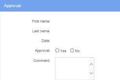
Approval
A section that contains first name, last name, and date fields in read-only, plus an approval radio button list and comment multiline textbox
Field
Description
Save as tool
Name
Enter a unique name for the custom tool
Tools
Select an existing tool in the drop-down list for replacement
Name / Icon
Description
Sections
Name
Name of the custom section tool
Delete the current custom section tool
Fields
Name
Name of the custom field tool
Name / Icon
Description
Close and apply the changes to the section
Close and cancel the changes
Validation
Behavior
✏️ Note: To simplify the capture of a condition, the form fields and operators are listed in the Select a field... and Select an operator... drop-down menus. You can also press Ctrl+Spaceto display a drop-down menu that lists the available variables and keywords.
Required
Sets the section fields to be required
Name / Icon
Description
Close and apply the changes to the field
Close and cancel the changes
General
Enable advanced mode
Enables the file attachment settings listed below
Enable download link
Check if you want to enable the link to open file
Name / Icon
Description
Add a new checkbox/radio button
Delete the current checkbox/radio button
Items
Drag and drop to change the order of the items
Checked
Check the default selected items in the field. The radio button field supports single selection whereas the checkbox field supports multiple selections.
Name / Icon
Description
Close and apply the changes to the field
Close and cancel the changes
Validation
Behavior
✏️ Note: To simplify the capture of a condition, the form fields and operators are listed in the Select a field... and Select an operator... drop-down menus. You can also press Ctrl+Spaceto display a drop-down menu that lists the available variables and keywords.
Maximum length
The maximum number of characters that can be entered
✏️ Note: Now also available for TextArea fields.
Name / Icon
Description
Close and apply the changes to the field
Close and cancel the changes
Items
Drag-and-drop to change the order of the items
Selected
Check the default selected items in the field
The DropdownListBox field supports single selection whereas the ListBox field supports multiple selections.
Name / Icon
Description
Close and apply the changes to the field
Close and cancel the changes
Columns
Drag-and-drop to change the order of the columns
Header text
Display text on the column header
Format types
Description
Numeric
The value is numeric
Currency
The value is a currency
Date Time (system)
WorkflowGen's default date time
Short date
6/10/2019 1:45:30 PM ➞ 6/10/2019 (en-US)
Long date
6/10/2019 1:45:30 PM ➞ Monday, June 10, 2019 (en-US)
Empty
Condition
Show file size
Value
Required
Value
Field type
Short time
protected void Page_Load(object sender, EventArgs e)
{
    base.Page_Load(sender, e);
    String stylePath=HttpContext.Current.Request.PhysicalApplicationPath.Replace("WfApps\\WebForms\\","App_Data\\Templates\\Forms\\En\\Default\\css");
    Page.Header.Controls.Remove(this.FindControl("StyleSheet"));
    Page.Header.Controls.Add(
        new LiteralControl(
            System.IO.File.ReadAllText(stylePath + "\\" + "metal.css")
        )
    );
    string imageUrl="http://mywebsite/mylogo.jpg"
    HeaderImage.Style["background-image"] = "url('" + imageUrl+ "')";
    HeaderTitleLabel.Text="My Title #";
    FooterTitleLabel.Text="My footer";
    imageUrl="http://mywebsite/myfooter.jpg";
    FooterImage.Style["background-image"] = "url('" + imageUrl+ "')";
}FooterImage.Style["width"] = "200px";
FooterImage.Style["height"] = "100px";accesskeydirlangtabindexxml:langonbluronchangeonclickonfocusonmousedownonmousemoveonmouseoutonmouseoveronmouseuponkeydownonkeypressonkeyuponselectenabledvisibleondatabindingondisposedoninitonloadonprerenderonunloadA list of examples of custom attributes is displayed at the beginning of the tab; you can choose one or enter a specific name.
Less than (<)
Less than or equal to (<=)
Not equal (<>)
controltocompareoperatorcompareerrormessageSharePoint
SingleStringUInt16UInt32UInt64Greater than or equal to (>=)
Less than (<)
Less than or equal to (>=)
Contains
Begins with
Ends with
Is null
Is not null
In
Not In
Between
http://server_name/service.asmx/getmyfilexmlThe XML file must be structured so that the properties of each element are expressed as attributes. If you have an XML file in which property values are expressed in a format other than attributes, you must:
Create a transformation file (.xslt) that can dynamically reformat the .xml file so that it is compatible with the XmlDataSource control.
Specify the path of your XSLT file in the "XSL transform file" parameter (see below).
appenddatabounditemsspsdatasourcespsdatalistspsdatavaluefieldspsdatatextfieldTextBox
✏️ Notes:
TextBox and TextArea fields in the GridView do not support the validation settings.
The Label field in the GridView does not support the databind settings.